This project started out with a negative space exercise in a potted plant
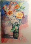
Next came flowers with coloured pencils. For me this was the most demanding exercise encountered to date.


The negative space exercise concentrated the mind on observing what is actually there and not what you expect to see. It required real concentration and helped focus on seeing space around objects and not drawing the object itself
This helped a great deal with the A2 drawing of flowers in coloured pencil. The white flowers proved very difficult in the preliminary drawing and I learnt to leave them out on the main drawing. I filled in the space around these and was able to maintain their pure white colour and some semblance of their spiky petals.
My only technique for drawing the plants in proportion was observation without any measuring techniques to compare one to the other.
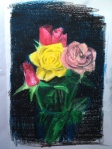
The different media used demanded different techniques. I found the marker pens needed a very basic illustrative style using line without any tone. Colours were largely what was offered by the pens rather than the roses themselves. The oil pastels required many layers and attempts at blending colours together. I ended up overworking this and found I had to really darken the background to suggest the lighter, delicate tones of the petals. The coloured pencils required much more concentration and a more subtle approach. Layers of colour were built up gradually concentrating on much smaller areas of the paper at a time.
The coloured pencil drawing of flowers looks three dimensional mainly through the masses of overlapping flowers. Also I put much more detail into the foreground plants to give an impression of depth. I intended to resolve the background with much more detail but ended up hinting at it instead in an attempt to make the flowers the focal point. I depicted the shadows in an attempt to anchor the vase and flowers into the space. With hindsight I should probably have made the background even darker to bring out the lighter tones of the bouquet. There isn’t much impression of depth with the marker pens and the roses appear to be floating due to the nature of the media and the style of drawing.
