 Patrick Joseph Caulfield, an English painter and printmaker born in Acton, West London in 1936 began studying at Chelsea School of Art continuing at the Royal College of Art (1960-63). He was associated with Pop art, through his participation in the New Generation exhibition in London 1964. He was always wary of this association, seeing himself rather as a “formal artist”
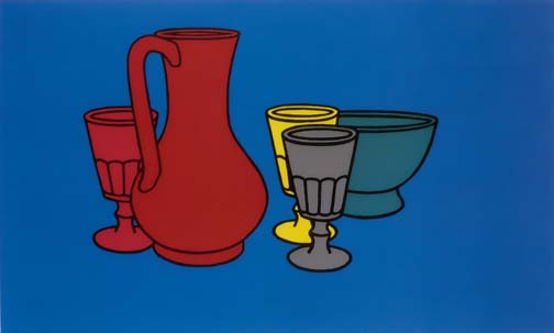
His early work was characterised by flat images of objects paired with angular geometric devices or isolated against unmodulated areas of colour. When he began painting he was quoted as saying that he started with the light,”without exactly knowing how I would end up”. In his obituary William Feaver of The Guardian newspaper described Caulfield’s paintings as “invariably stylish, allusive, celebratory, inventive, range from profuse to succinct and all of them are substantiated by wily observation and deadpan wit”. He went on “The paintings absorbed banalities. The painter rendered them worthy, memorable, cherishable even, as emblems of modern life” An example can be seen in “Coloured Still life”

Five simple objects against a plain blue background stripped down to bare essentials, form and colour.
Gradually his attention shifted to architectural interiors “atmospherically suffused with a single enveloping colour”. These paintings are figurative, often portraying a few simple objects in an interior. Typically, he used flat areas of simple colour surrounded by black outlines. Some of his works are dominated by a single hue He developed this theme further introducing highly detailed interiors such as “After Lunch”

Later, in the eighties he returned to a more stripped down aesthetic, particularly in large paintings in which the precise disposition of only a few identifiable elements miraculously transforms an ostensibly abstract picture through the creation of a vivid sense of space – Tate online
He died in september 2005. Tate galleries director Nicholas Serota described Caulfied as”one of the most original image makers in a talented generation of British artists”
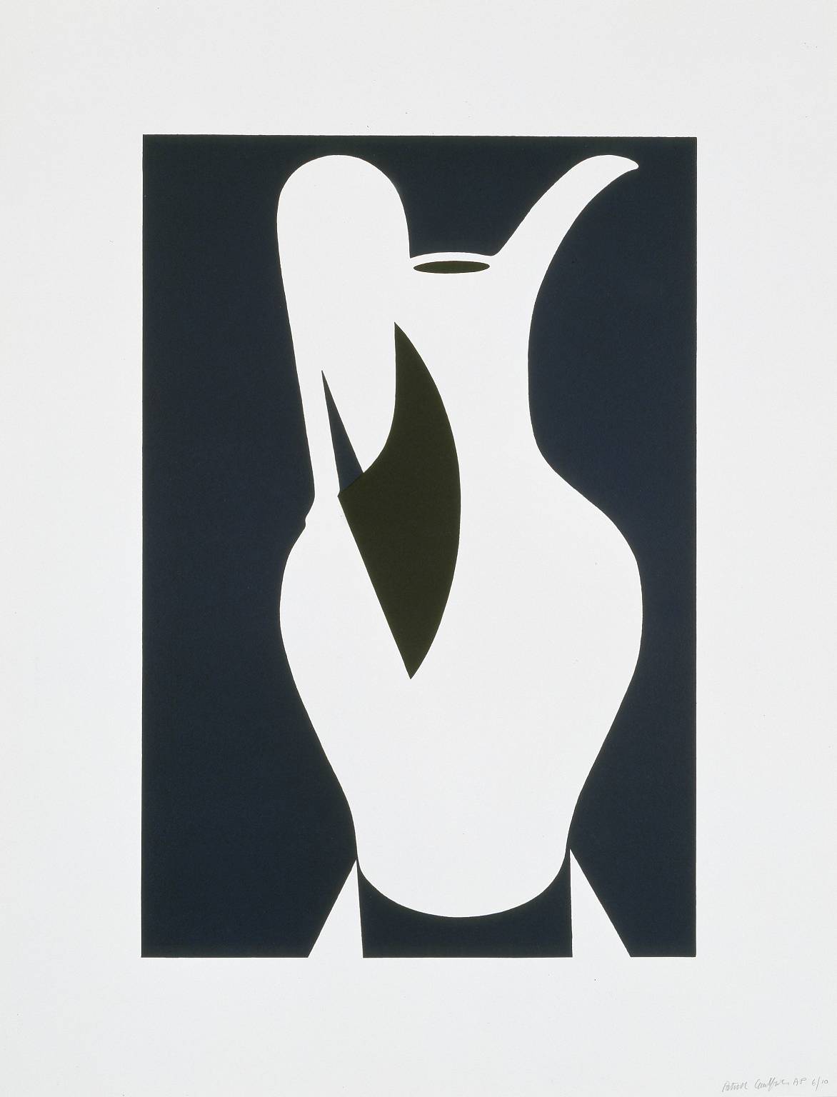
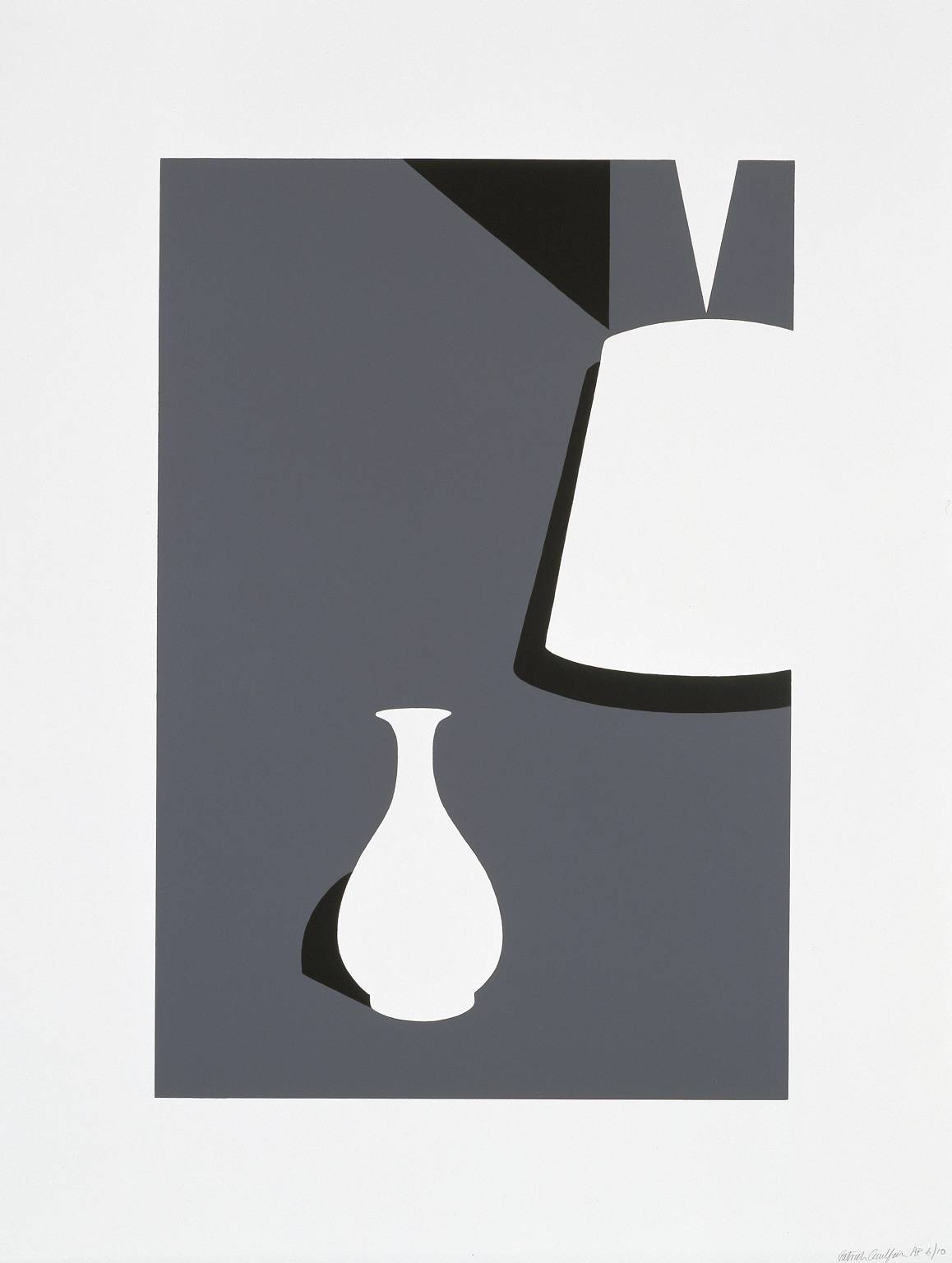
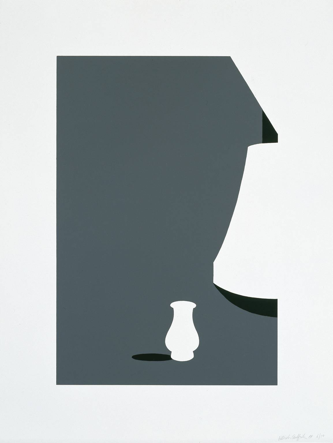
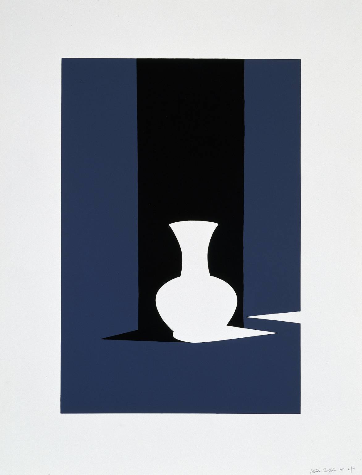
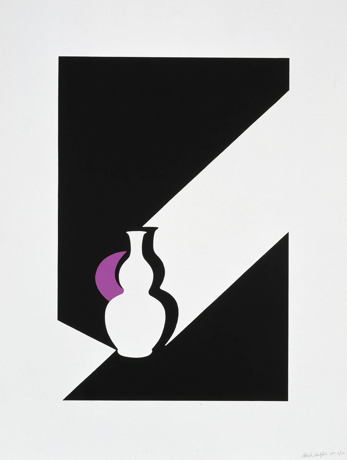
Negative space.
In Caulfield’s series of screenprints “White Ware” the empty,or negative space appears to be the focus of the painting. In Lamp and Kuan Ware the white lamp and vase are reduced to secondary importance to the blue grey background. The shape it makes draws the eye away from the vase to explore the space around.

“Two Fish on a Plate” also places the emphasis on the shadows. The fish merge into the shadow and the plate itself casts a shadow which creates a harmonious white shape which, to me is more important than the subject matter i.e the fish are reduced to secondary importance.

Sources:
http://www.oxfordartonline.com/
http://www.tate.org.uk/art/artists/patrick-caulfield-873
http://en.wikipedia.org/wiki/Patrick_Caulfield
http://www.patrickcaulfieldprints.com/
http://www.guardian.co.uk/news/2005/oct/03/guardianobituaries.artsobituaries
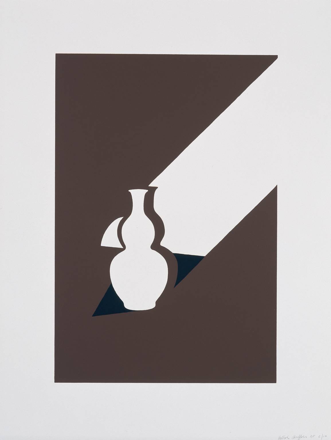
Picture is the style of Patrick Caulfield
My previous course work, the pan and flask in charcoal appears to be the ideal subject if I reduce it to it’s basic light and shade. I sketched a few scenarios but wasn’t satisfied that the vacuum flask was an interesting enough shape or indeed identifiable.
 A brown beer bottle sketched earlier might be more readily identified and instantly recognisable so I sketched a few different ideas, varying the table surface and light source. This was the final outcome. I couldn’t get a flat black tone with the media I had to hand so I created a collage on black paper.

“Thus he arrived last weekend and supped the beer”

